Webflow Accessibility: Visual Disabilities

.webp)
Let's talk about web accessibility. This is Part 1 of a 3-part series on Web Content Accessibility Guidelines 2.2 compliance for Webflow.
Web accessibility means building websites anyone can use, regardless of ability or device. It helps people with disabilities access content, but also benefits mobile users, older adults, anyone in bright sunlight, or on slow connections.
As of June 2025, it's legally required. The European Accessibility Act is now in effect. If you're building for travel, banking, or e-commerce companies serving EU customers, Web Content Accessibility Guidelines 2.2 Level AA compliance isn't optional.
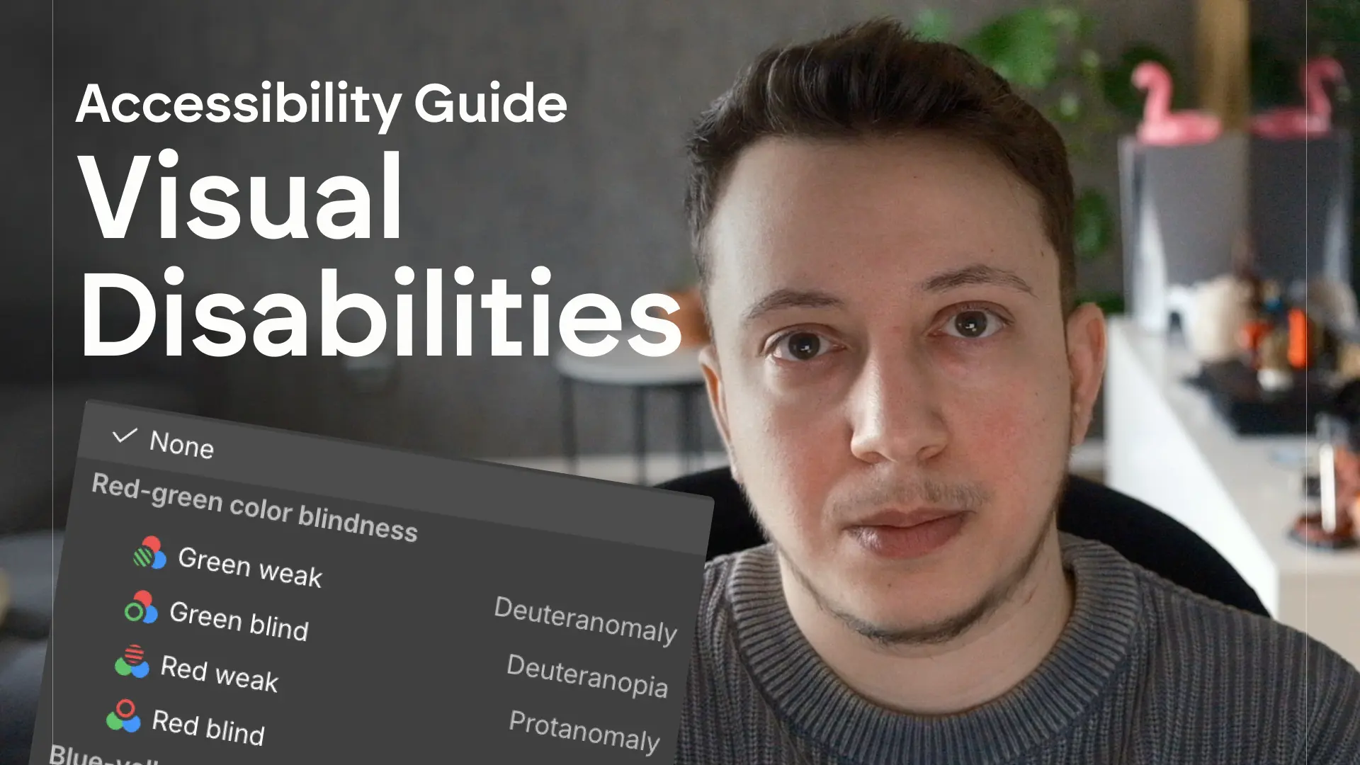
This part covers visual disabilities: blind users, low vision, color blindness, and age-related vision decline. We'll go through font selection, contrast ratios, semantic HTML, ARIA labels, alt text, and more.
Quick disclaimer: use this as a starting point, not a complete audit. Legal requirements vary by jurisdiction and industry, and your site might need specific considerations I'm not covering.
For more in-depth information, please check out the YouTube tutorial:
Visual Disabilities
Who this applies to:
- Blind users
- Low vision
- Color blindness / limited color perception
- Presbyopia (age-related vision decline)
Font selection for legibility (AA)
Choose fonts that are easy to read. Appropriate text sizing and spacing help visually impaired people read important text and help those with cognitive disabilities focus better on text blocks.
Good resources:
Text styling for legibility (AA + AAA)
Appropriate text sizing and spacing ensure that visually-impaired people can read important text, and help those with cognitive disabilities to better focus on text blocks.
- Letter spacing (tracking) at 0.12 times the font size
- Word spacing at 0.16 times the font size
- Line height (line spacing) at 1.5 times the font size
- Spacing after paragraphs at 2 times the font size
- Use left-aligned text for left-to-right languages, right-aligned for right-to-left languages
- Avoid centered text for more than one sentence on a page
- Limit characters to less than 80 per line (use the ch unit to set container width based on the character "O" for a given font) - (AAA)
- Don't justify text (AAA)
Resize text (AA)
Users must be able to resize text up to 200% and the spacing without losing content or functionality.
Test: chrome settings → appearance → customize fonts → font size → x2
- Use rem for all font-size properties
- Use relative units like em, %, and viewport width/height for all spacing and length properties.
Color as meaning (AA)
Color alone isn't enough. Information conveyed only through color isn't available to people with limited color vision.
- Color must not be used as the only visual means for conveying meaning (eg. "Required fields are marked with a red asterisk")
- For success and error states (typically green and red), add additional indicators:
- Use an icon for each state with text alternatives
- Use explanatory text like "Error" or "Success"
Sufficient contrast (AA + AAA)
People with mild visual disabilities, low vision, or limited color perception struggle with low-contrast text. People with presbyopia (age-related vision decline affecting 1.8 billion people worldwide) also need sufficient contrast.
Contrast ratios (AA):
- Regular text: contrast ratio ≥ 4.5:1
- Large text (18pt or 14pt bold): contrast ratio ≥ 3:1
- UI components and state changes: contrast ratio ≥ 3:1 for any visual boundary or effect that indicates a component's clickable area or state
Contrast ratios (AAA):
- Regular text: contrast ratio ≥ 7:1
- Large text: contrast ratio ≥ 4.5:1
- Add text outlines or shadows when using bright-on-bright palettes (like red-on-gold or white-on-yellow)
Visual presentation fully customizable (AAA)
Don't lock visual presentation with CSS that prevents users from customizing text. Users with specific visual needs rely on browser settings or extensions to change colors, spacing, and text width. Avoid fixed pixel heights, excessive !important rules, and layouts that break when users adjust font size or spacing.
What breaks this:
- Fixed pixel heights that clip text when users increase font size
!importantrules that override user stylesheets- Absolute positioning that breaks when users adjust spacing
- Background images with text that can't be recolored
Visible focus indicators (AA)
Interactive elements must show a visible indication when they have input focus.
In Webflow, you can style the Focused state or Focused (keyboard) state to make interactive elements more visible to users relying on keyboard navigation.
Enhanced focus appearance (AAA)
The focus indicator must be highly visible with enhanced contrast and size. The indicator must have a contrast ratio of at least 3:1 against adjacent colors and be at least 2 CSS pixels thick around the entire perimeter of the focused element.
Focus not obscured enhanced (AAA)
When an element receives keyboard focus, no part of the focus indicator can be hidden by other content. At the AA level, the focused element can be partially obscured as long as it's not completely hidden. AAA requires the entire focus indicator to remain visible at all times.
Semantic HTML and heading hierarchy (AA)
Semantic HTML means using the right HTML tags for the job. Instead of building everything with divs and spans, use elements that describe what they contain: nav for navigation, article for articles, button for buttons, header for headers. Semantic HTML gives structure and meaning to your content, which helps screen readers understand the page and navigate it properly. Avoid div and span overuse and use tags that convey meaning.
- Use appropriate semantic tags (main, nav, links)
- Headings hierarchy (H1 → H2)
- Text that looks like a heading must be coded as a heading
- Only one H1 per page
- Don't skip heading levels
- Use classes to style content
CSS positioning
Assistive technologies present content in DOM order (the order content appears in the HTML). When CSS modifies only the visual order, assistive technologies might not be able to determine the expected reading order. Some people with limited vision need to customize styling to see content, and positioned content might move to a location where its meaning is changed or lost.
- If you use position:absolute, make sure the DOM order matches the expected reading order
- Avoid using float:right, as it always creates a mismatch (elements displayed on the right appear in the DOM before those on the left)
ARIA labels (AA)
HTML tags give structure and meaning to elements, but sometimes that's not enough. For example, a link that only contains an icon doesn't explain what that link does. Use ARIA labels to provide that extra meaning, like describing an icon as "LinkedIn" or "Share."
- Add ARIA labels to link blocks, navbar logos, and anywhere you need to describe function for assistive technologies
Alt text for images (AA)
Alt text is a textual description of an image. Content conveyed through images alone isn't available to people who are blind or who have limited vision or cognitive disabilities. Text alternatives can be rendered as text, braille, or speech, making image content available to everyone.
Alternative text is a textual description of an image embedded in a page. Add alt text to all images (check this in Webflow's audit panel or Assets panel). For images inside CMS, create an alt text field for dynamic images.
Decorative images should be set as "decorative".
- Add alt text to all images (check audit panel)
- Add alt text field in CMS for CMS images
- Add alt text to videos embedded with custom code (including thumbnail images)
- Mark decorative images as decorative
No images of text at all (AAA)
At the AAA level, images of text are not allowed at all, with very limited exceptions like logos. This is stricter than AA, which permits images of text when essential. Use actual HTML text with web fonts instead of embedding text in images, even for decorative purposes. This ensures text can be resized, recolored, and read by assistive technologies.
Skip-to-main link (AA)
Keyboard users tab through every link on a page. Without a skip-to-main link, users are forced to tab through every navigation link before getting to the main content. Add a "Skip to content" link at the top of the page that's hidden until focused, allowing users to bypass header content and jump directly to the main content.
You can use this clonable I created to create this.
Localization (AA)
Translate text, page slugs, meta titles and descriptions, CMS items and page slugs, and alt text for images. This helps users understand content in their language.
Search engines prioritize relevant, localized content. Adding locales helps your site rank for region-specific keywords, bringing in more organic traffic from each region you serve. Translate text, page slugs, meta titles and descriptions, CMS items and slugs, and alt text for images, with Webflow Localization add-on.
Language of page (AA)
When a page's default language is programmatically identified, browsers and assistive technologies can render text more accurately. Screen readers use the correct pronunciation, visual browsers display the correct characters, and media players show captions correctly.
Language of parts (AA)
If the language of a passage differs from the default language of the page, the passage must have its own language attribute.
When a passage has the correct language attribute, browsers and assistive technologies render text more accurately.
Add attribute lang="[language]" (i.e. lang="es") inside the settings pannel for the text element with a different language.
Conclusion
This covers visual disabilities and accessibility in Webflow. In Part 2, we'll tackle hearing and motor disabilities — captions, keyboard navigation, touch targets, and form accessibility.
If you found this helpful, leave a comment and let me know what other tutorials you'd like to see.